Understanding Health Disparities in Oregon and Mexico: A Descriptive Epidemiology Study

Descriptive epidemiology is concerned with answering questions such as who is affected, when and where the disease or health condition occurs, and what are the characteristics of the affected population. The research and navigation to collect and analyze data from various sources was used to generate descriptive statistics, such as incidence rates, prevalence rates, and mortality rates, which are used to describe the patterns and distribution of diseases or health conditions in a population.
This assignment carried significant weight in determining my final grade for HE375 Epidemiology, a mandatory course for my Public Health major at Western Oregon University. For my research project, I selected Oregon as the state for the national level analysis and further zoomed into Polk County. Additionally, for the international level, I directed my attention towards Mexico.
Oregon’s Health at a National Scale
Exploring the US Census
My parents chose Oregon as their home state almost 25 years ago, after migrating around the United States for some time, and I am so grateful they did. I was born and raised in Oregon and appreciate the diversity of each region, which is why I chose to base my national research on Oregon.
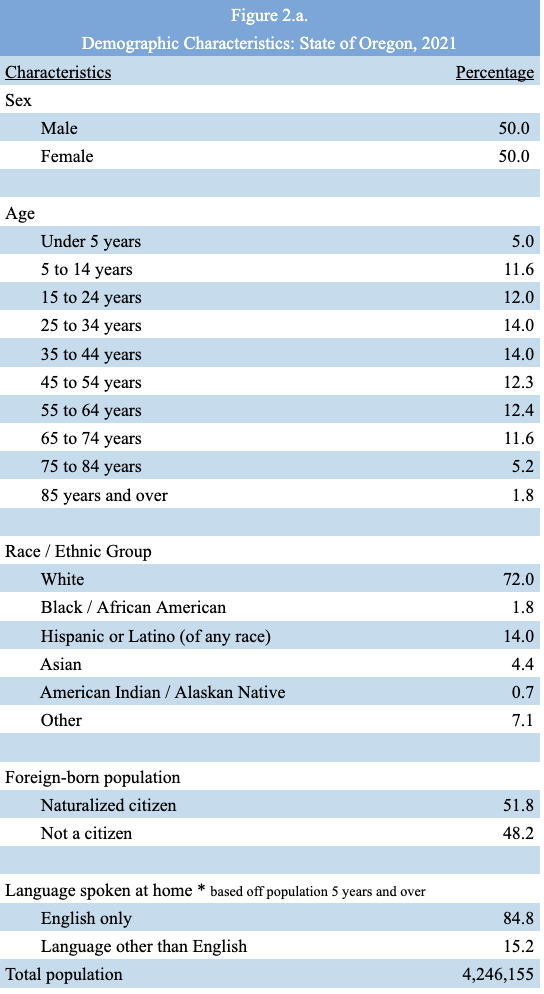
These statistics are essential to understand disease development. Two other characteristics I decided to include in my table were data for foreign-born populations with and without U.S. citizenship, and the language spoken at home, which is based on the population aged 5 and up. These characteristics are essential for health professionals because undocumented immigrants who have not naturalized in the United States are barred from participating in most federal healthcare programs, limiting their access to accessible and affordable healthcare. It is also crucial for health professionals to be aware that many people do not speak or practice English at home; therefore, without the assistance of a (paid) interpreter, the person receiving care may be misinformed or misdiagnosed when receiving and exchanging medical documents.
Using the CDC Behavioral Risk Factor Surveillance System (BRFSS)
The Behavioral Risk Factor Surveillance System (BRFSS) is one of the United States’ pioneers in health-related telephone survey systems, collecting state data on U.S. residents’ health-related risk behaviors, chronic health conditions, and the use of preventive services. BRFSS started in 1984 working within 15 states and has now expanded through all 50 states, the District of Columbia, and three U.S. territories.
The data collected from BRFSS would be useful to me as I pursue a public health career because by using these tools I would be able to assist with the implementation of disease prevention and health promotion activities, and the monitoring of trends.
State health departments use in-house interviewers or contract with telephone call centers or universities to conduct the BRFSS surveys throughout the year. The states use a standardized core questionnaire, optional modules, and questions specific to their state. The survey is conducted on both land-lines and cell phones using “Random Digit Dialing” (RDD) techniques.
BRFSS data runs the risk of information, reporting bias, specifically, socially desirable responses because people who are surveyed could feel compelled to lie to avoid embarrassing themselves.
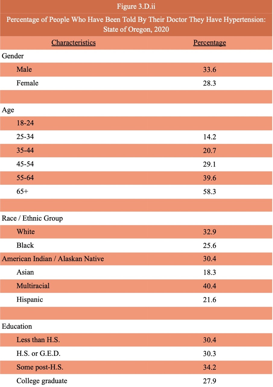
Breakdown of the hypertension data in Oregon by gender, age, race, and education.
According to the CDC Behavioral Risk Factor Surveillance System (BRFSS) data for Oregon as of 2021, 30.9% of adults have been told by a doctor that they have high blood pressure. In the United States, 32.2% of adults have been told by a doctor that they have high blood pressure, compared to Oregon, the national average is 1.3% higher.
Oregon Oral Health and BMI Data from the BRFSS Questionnaires
The topic I chose for the state of Oregon, based on the 2020 data, was about oral health; adults that have had any permanent teeth extracted. The question asked in the BRFSS questionnaires was specifically worded as “Not including teeth lost for injury or orthodontics, how many of your permanent teeth have been removed because of tooth decay or gum disease?”. In Oregon, based on the 2020 data, 38.6% of adults have had at least one or more permanent teeth extracted. In the US, 40.2% of adults have had at least one or more permanent teeth extracted. Oregon is below the US benchmark with only a 1.6% difference.
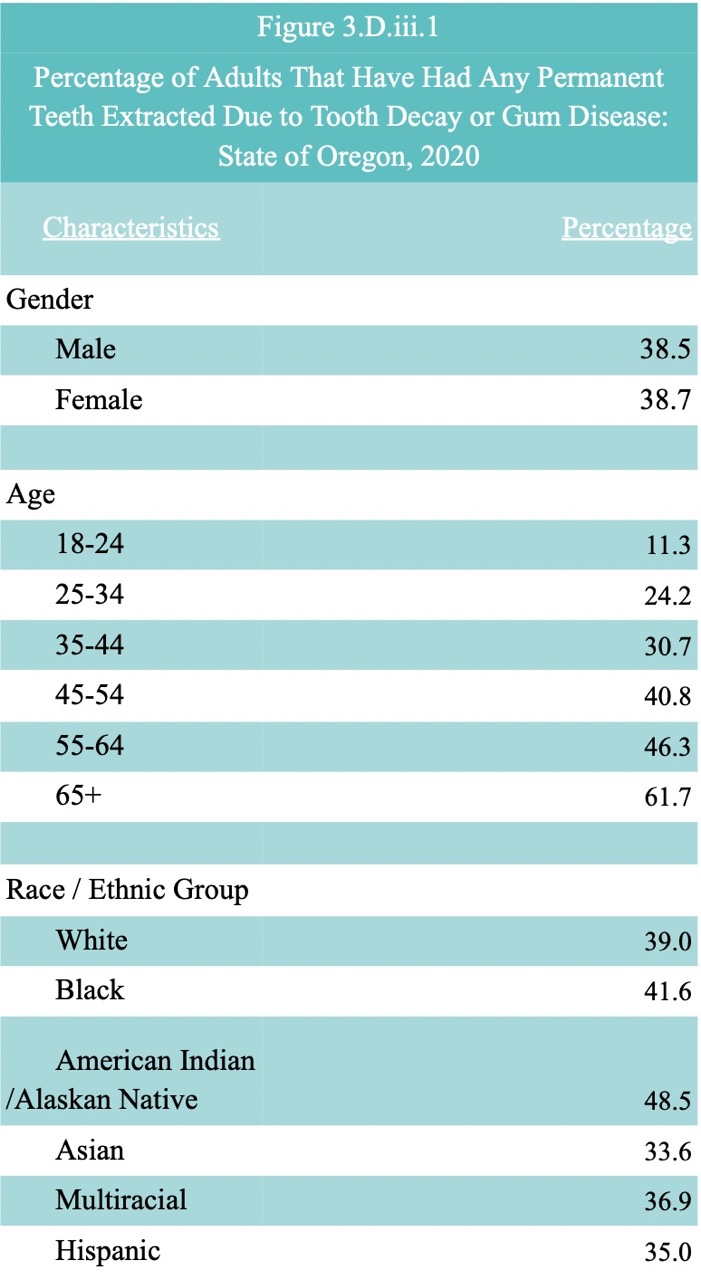
In 2020, the percentage of adults that have had any permanent teeth extracted due to tooth decay or gum disease in the state of Oregon showed many differences but similarities as well. Both males and females were pretty equal, males sitting at 38.5% whereas females were at 38.7%, both males and females were similarly susceptible to tooth extraction. Those aged 65 and over were the most susceptible to tooth extraction with a percentage of 61.7%, between ages, the percentage has a linear relationship because the older you get the more likely you are to get teeth removed. Looking at the race and ethnic groups, American Indians / Alaskan Natives were the most susceptible to getting teeth extracted with the highest percentage of 48.5. All other races and ethnic groups were below 40%.
The second topic I chose to look further into for the state of Oregon, based on the 2021 data, was weight classification by Body Mass Index (BMI). To categorize the data there were two separate questions asked and based on the answers for each person, their BMI was calculated. The questions asked in the BRFSS Questionnaires were specifically worded as “About how much do you weigh without shoes? About how tall are you without shoes?”. In Oregon, based on the 2021 data, 65.1% of adults are classified as obese or overweight. In the US, 68.2% of adults are classified as obese or overweight.
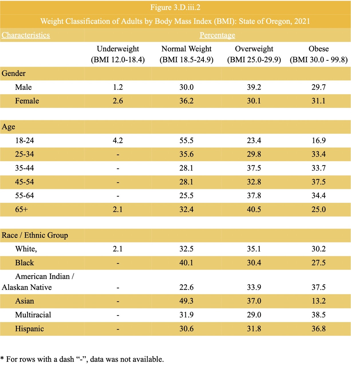
In 2021, there wasn’t data available for American Indian/Alaskan Native, Asian, multiracial and Hispanic races and ethnic groups who could be underweight based on their BMI. Combined, the percentage of males who are overweight or obese is greater than the percentage of females who are overweight and obese, making males more susceptible to a higher BMI. From ages 18-24, 55.5% were at a normal BMI but the relationship between BMI has a consistent linear relationship in the data table because the BMI increases as age increases. Between racial and ethnic groups, American Indians/Alaskan Natives are the most susceptible to becoming obese or overweight. Overall, I found the BRFSS website to be very interesting, the BRFSS Prevalence & Trends Data Is such a useful tool for people who are curious about the prevalence of different health factors. It’s cool to see the data dating back to 1999. I found that the percentage of males and females in Oregon having had at least one tooth or more removed because of tooth decay or gum disease has greatly decreased since 1999. The percentage for females based on 2020 data was 38.7 and in 1999 it was 51.7. For males, it was 38.5 in 2020, and 54.0 in 1999.
Navigating the Robert Wood Johnson Foundation County Health Rankings and Roadmaps
One of the main findings that I thought was interesting was the geographic differences in school funding have a correlation dating back to the history of racial discrimination, violence, and exclusion. The summary listed that many counties in the Western and Southern U.S. do not spend enough money on the students for them to achieve national average test scores. It was found that counties with a great amount of Black, Hispanic, and American Indian / Alaska Native populations are experiencing funding deficits. I recently finished listening to the “Nice White Parents” podcast by Chana Joffe-Walt. Being a first-generation student, mixed with the fact that I went to predominantly white (private) schools, I honestly don’t have much exposure to how the public school system works. I uncovered some of my own biases from listening to the stories of the continuous systemic oppression towards the students who don’t fit in the “box” of school policymakers and how nothing is done to help revive curricula that work for the students.
I can see these data being susceptible to information, recall, can’t remember bias. During the data collection there is a possibility for an error in the classification of study participants’ exposure or outcome status.
Premature Death Health Outcome in Oregon
Premature death is measured as the years of life lost for those under 75 years of age per 100,000 people. The County Health Rankings sourced its data from the National Center for Health Statistics, specifically, the Mortality File. The 2022 reporting represents the data from 2018 through 2020. Based on the 2022 reporting representing data from 2018 through 2020, out of all the counties in Oregon, 4 counties did not have any data available - which were all rural. Jefferson County had the most years of life lost, 10,700 years, 81.9 of those years stemming from malignant neoplasms, a cancerous tumor. Besides being ranked as the #1 healthiest county, Benton County had the lowest number of years of life lost in deaths of people under age 75, per 100,000 people, totaling to only 4,000 people. The leading cause of those years lost was also malignant neoplasms. As a whole, the state of Oregon lost an average of 6,100 years of life which is just a bit below the United States average of 7,300 years of life.
Health-related measures in Rural vs. Urban Counties in Oregon
According to the 2020 Census data the rural county I explored, Gilliam County, has a population density of 1.7 people per square mile. For the urban county, I explored Washington County, the population density is 828.9 people per square mile.
I chose to investigate diabetes prevalence of adults 20 years and older, the measure was defined by only including those who reported being diagnosed with diabetes.
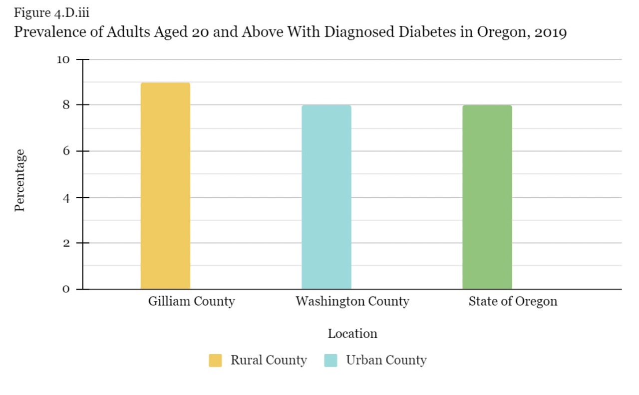
I choose Gilliam county as my rural exploration and Washington County as my urban exploration. I thought there would be a great difference between these two counties because Washington County includes the Portland metropolitan area. The population density is high and with the huge amount of promotion I’ve seen of health initiatives throughout the major cities of Washington County, I thought the prevalence of adults with diagnosed diabetes was going to be low in comparison to a rural county and the state of Oregon. Every google question I looked up trying to find whether a rural county or an urban county was more prevalent to diabetes contradicted itself. Some reports stated urban counties as most prevalent in diabetes because of big access to fast food and other reports stated urban counties are least prevalent in diabetes because of all the walking one has to do to get around to places. Across the board, the two counties and the state of Oregon had a very close relationship and I’m surprised to know that the rural county I chose, Gilliam, is only 1% more prevalent than the urban county and Oregon.
From State to County
Dissecting the Oregon Healthy Teens Survey
In 2017, 14,852 8th graders and 11,895 11th graders were surveyed. In the 2019 survey, 43,783 8th graders were enrolled but only 15,256 were valid surveys, 42,949 enrolled 11th but only 12,834 were valid surveys. The numbers between Polk County compared to the state of Oregon as a whole are quite similar. In 2019, the majority of 8th graders, 47%, and 11th graders, 50%, identified as White. In Oregon as a whole this is also true, the majority of 8th graders, 56.7%, and 11th graders, 61.4%, also identified as White.
I compared the access to health care for the teens in Polk county to the teens in the State of Oregon as a whole. The three measurements indicate where there can be a lack of a certain factor that could be adjusted to ensure there is health equity; lack of routine care, unmet needs in the last 12 months, and emergency room or urgent care visits for physical or mental health care need in the past 12 months. Under the lack of routine care, I specifically looked at the teens reporting no dental check-ups, teeth cleaning, or exams in over a year. State of Oregon 8th graders note 13.2% of those reporting hadn’t met this need and 18.3% of 11th graders hadn’t met this need either. The percentages for Polk county are just as high. 18.1% of Polk 8th graders reported they had not been able to see a dentist for a check-up, cleaning, or exam and 16.3% of 11th graders reported this unmet need as well. This means that those reporting the unmet need do not currently have the chance to live up to their full health potential. Having been a dental assistant I understand that many teens face some sort of dental anxiety or just come from a family that does not find oral health care important since the influences on both the health of a person and a population are social determinants and the environments in which individuals choose to live, work, learn, and play. Overall I’m thinking about the negative impact on their health and quality of life the teens with the unmet need might face in the future and the debt that may come along with it if their last resort is to go to the emergency room due to unmet preventative dental care.
School Based Health Centers health indicator
The health indicator I was most interested in was students reporting their school has a School-Based Health Center and the students reporting having used the School-Based Health Center one or more times in the past 12 months out of students attending schools with school-based health centers.
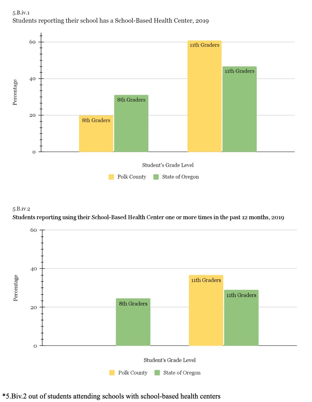
In Polk County, only 19.8% of the students reporting stated that their school has a School-Based Health center, and out of those students at schools with SBHC, only there wasn’t any data reported for any 8th graders using the SBHC’s at their schools. For the State of Oregon, 31% of 8th-grade students reported having an SBHC and 24.5% of those students reported using the SBHC in the last 12 months. The numbers were a lot bigger for both Polk County and the State of Oregon among 11th graders. 60.9% of 11th graders in Polk County reported their school having an SBHC, of those, 36.7% reported having used the SBHC at least once in the last 12 months. In comparison to the State of Oregon, 47.6% reported having an SBHC and 29% reported having used the SBHC at least once.
Mexico and the Global Health Landscape
Utilizing the Institute for Health Metrics and Evaluation (IHME)
I chose to base my international research off of Mexico because I was recently there from August 2022 to October 2022 and, unfortunately, my cousin broke her arm on our day trip into the city, an hour away from our home, since we were in a city the nearest urgent care was just a few minutes away by car, but because it was a private office, the cost of just getting x-rays and basic care for the fracture was nearly a year’s worth of my uncle’s salary.
The University of Washington’s Institute for Health Metrics and Evaluation (IHME) is in charge of the Global Burden of Disease (GBD), which was initiated in the early 1990s. It has expanded over the past 20 years into a global network of approximately 5,500 researchers, and its estimates are updated every year. The Global Burden of Disease (GBD) is an attempt to explore a thorough picture of changes in health, including mortality and disability across nations, time, age, and sex. This can be helpful for decision-makers, health workers, and researchers in different countries to compare their countries’ health progress to that of other countries and to comprehend the primary causes of health loss that could potentially be avoided.
By utilizing the Country Profiles section, we can examine figures presented in Mexico’s country profile and interpret their meaning. I chose the figure titled “What is the fertility trend now and in the future?”. The main point is to compare the fertility rate between Mexico, Latin America, and the Caribbean, and at a global status. It represents the fertility rate based on the average number of children a woman delivers over her lifetime. The data begins in 1990 and estimates the fertility rate through 2100. The horizontal axis is the exposure measured as years starting at 1990 through 2100. The vertical axis is the outcome which is the total fertility rate. Within the data of Mexico, Latin America, the Caribbean, and globally, the fertility rate seems to be declining at a steady pace. The second figure I chose was titled “What is the mortality trend in the under-5 and under-1 age groups?”. The main point is to represent the mortality rate of those under 5 years old and those under 1 year old. The data begins in 1990 and estimates the fertility rate through 2100. The horizontal axis is the exposure measured as years starting 1990 through 2019. The vertical axis is measured as deaths per 1,000 live births. Since 1990, the mortality trend for both, those under 5 and those under 1 have steadily decreased through 2018.
Replicating the Life Expectancy line graph for Mexico from 1990 to 2100
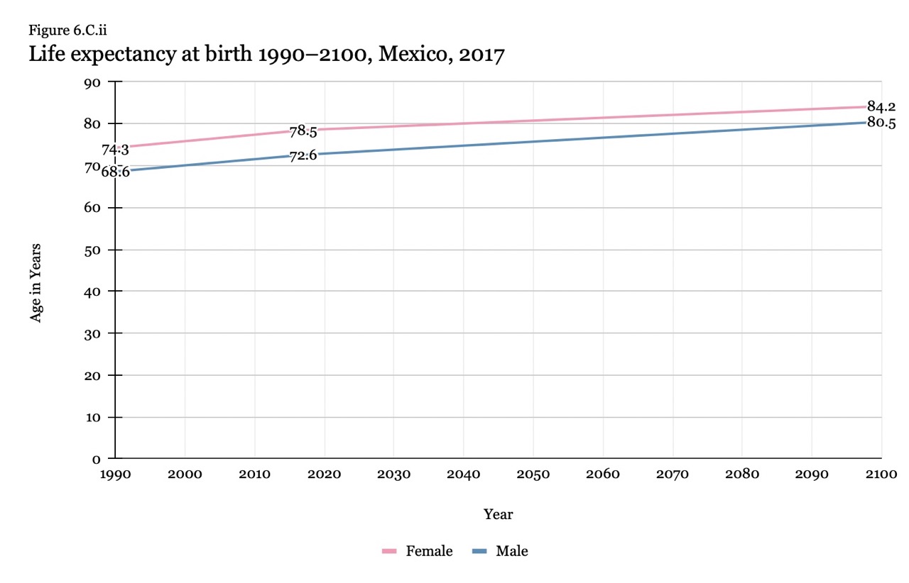
Examining the visual representation of data
I compared the data of Mexico focusing on both males and females cumulatively, globally, high income, the Central American region as a whole, and the country of Guatemala. The life expectancy at birth from Central America was 71.17 in 1990 and by 2040 is projected to increase to 78.58 years. This is very similar to the life expectancy in Mexico, in 1990 it was 71.62 and is now projected to increase to 78.26 by 2040. In comparison to the life expectancy at birth in Guatemala, in 1990 it was 64.63 but is projected to increase to 76.02 by 2040, a bit below Mexico and the projected estimate of that region but it’s not far behind. There is a big difference comparing Mexico, and Guatemala as well as Central America, to high-income major regions. In 1990 the life expectancy was 74 and is expected to steadily increase to 82.4 by 2040. Globally though, Mexico is doing a bit better than the earth’s expected projection. In 1990 the life expectancy was 65.1 and is projected to increase to 76.9 by 2040. Overall I would rank Mexico into the 3rd state of the epidemiological transition, where they are facing the receding pandemics of heart disease, accounting for 11.19% of the total deaths, diabetes accounting for 11.81% of total deaths, and chronic kidney disease accounting for 11.57% of total deaths.
I looked at the National Health Accounts (NHA) Visualization world map. I chose to look a bit further into Germany because I have relatives who immigrated from Mexico to Germany over 30 years ago. I keep close contact with my family in Germany and my relatives who are the same age as me have come to visit Oregon plenty of times love it here, but have stated they would never try to make a life here because the government doesn’t care about its people the way Germany does. Germany has many measures in place to help its citizens live up to their full health potential. Based on the 2009 data, the federal government finances 77% of healthcare.